Farmhouse Textures: Wood, Linen, Woven Fiber and Other Natural Materials
The materials behind the layered farmhouse feel and what each one adds, a three-rule formula for combining them, and practical habits that keep mixed wood tones from clashing.
When a neutral room looks flat, the missing ingredient is rarely color. It is surface. Farmhouse textures, meaning the grain of wood, the slub of linen, the ridges of a basket and the soft glaze of stoneware, are what give pale rooms their depth.
Each material adds something different, and a room needs several of them working together. Once you know the vocabulary, a simple formula tells you what to add next.
The materials and what each one adds
Wood
Wood brings warmth and pattern at once. Tone sets the mood, from pale oak to deep walnut, while grain adds fine detail that the eye reads as richness. A matte or lightly waxed surface suits the style better than high gloss. Aim for two or three wood tones in a room, chosen on purpose.
Linen and cotton
Washed linen has a slightly irregular weave and a soft rumple that looks relaxed the moment it is in place. Cotton is smoother and crisper, which makes it a good partner. Use them for curtains, cushion covers, slipcover-style upholstery and bedding, and follow the care labels when you wash them. The guide to layering farmhouse bedding shows how the two combine on a bed.
Wool and chunky knits
Thick knits are the deepest texture most rooms will have, with strong shadows between the stitches. A little goes a long way: one throw on a sofa or across the foot of a bed, or a single knitted cushion.
Woven fibers
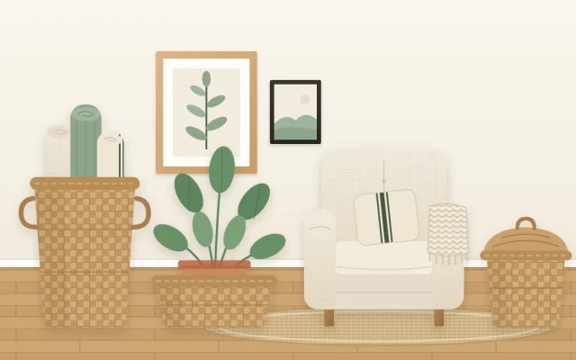
Jute, seagrass and rattan add a dry, rough, handmade quality. Jute usually appears in rugs, seagrass in baskets and rattan in chairs, trays and lampshades. Wicker is the name of the weaving method, not of a fiber, so a wicker piece may be made from any of several materials. Baskets are the easiest way in, and the guide to decorative baskets covers where to put them.
Stoneware and matte ceramic
Jugs, crocks and bowls with a soft, slightly speckled glaze feel solid and calm. Their smooth, cool surface is the natural opposite of wood and weave, which is why a single jug on a wooden table looks so complete.
Glass
Clear or lightly tinted glass adds a note of shine and lets light pass through. Bottles, jars and simple vases keep a shelf from looking heavy when everything else on it is opaque.
Galvanized-look and black metal
Soft gray metal with a dull, mottled surface adds a utilitarian touch in a pot, a tray or a bucket. Black metal is sharper: lamp bases, frames and curtain rods outline a room and give pale textures an edge to sit against.
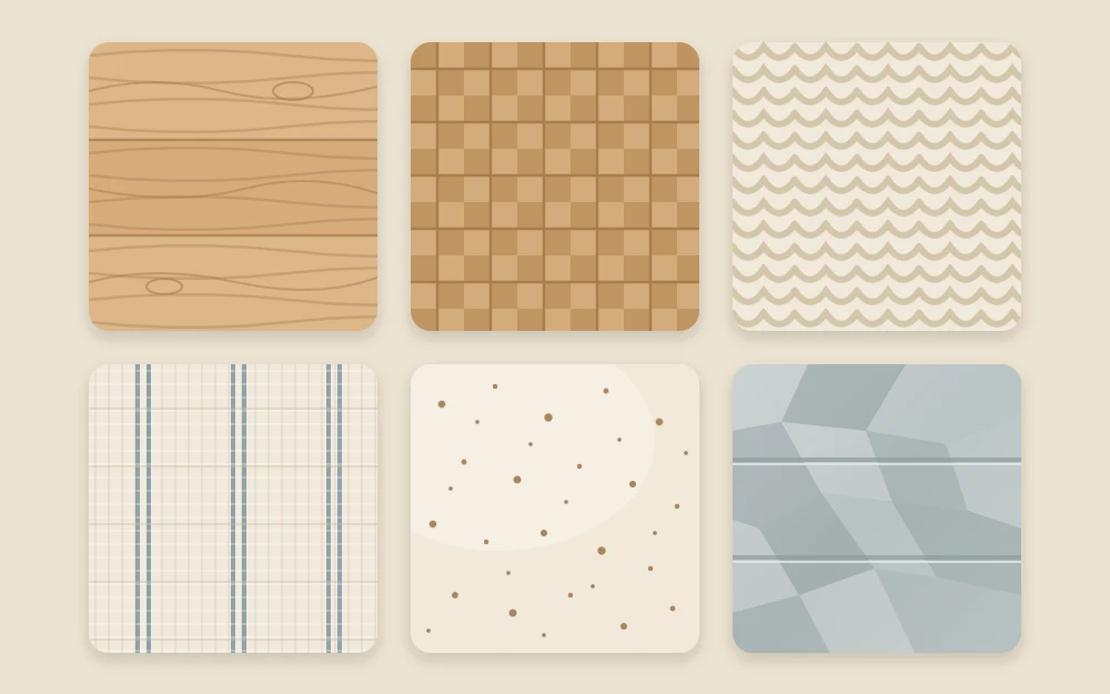
A simple formula for layering
- Pair rough with smooth. Set a woven basket beside a ceramic jug, a knitted throw on a plain linen sofa, a jute rug under a smooth wooden table. Each makes the other more noticeable.
- Pair matte with a little sheen. Most farmhouse surfaces are matte. One or two things that catch the light, such as a glass vase, a glazed bowl or a metal lamp, stop the room from looking dusty.
- Repeat each texture at least twice. A material that appears once looks accidental. Twice or three times, spaced around the room, it looks like a plan.
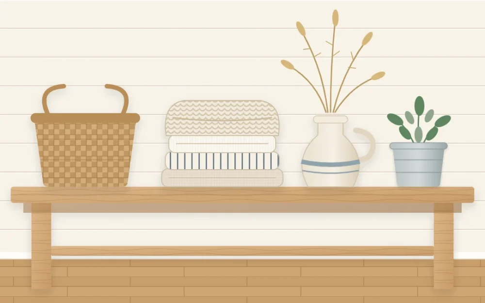
A wooden bench against a wall shows the formula at small scale. Put a stack of folded linen and a knitted throw on it, a woven basket beside them, a stoneware jug of dried stems and a small galvanized pot with a plant. That is five materials in a short stretch of space, with nothing colorful among them, and it looks finished.
Tip
Count materials, not objects. If a shelf or tabletop holds five things that are all ceramic, trade two of them for wood and something woven instead of adding a sixth.
How to keep wood tones from clashing
Mixed wood looks collected. Mismatched wood looks accidental. The difference lies in a few habits.
- Match the undertone, not the shade. Woods that all lean warm (yellow, honey, red-brown) or all lean cool (gray, ash) sit together even when one is far darker than another.
- Let one tone lead. Usually that is the floor or the largest piece of furniture. The others play supporting parts.
- Make the difference obvious. Two tones that are almost the same look like a failed match. A clear step lighter or darker looks chosen.
- Repeat every tone. If a dark stool is the only dark wood in the room, echo it with a frame or a bowl.
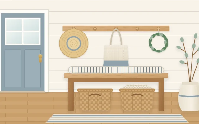
- Separate with something soft. A rug between a wooden floor and a wooden table, or a runner along a wooden bench, gives each piece its own outline.
Reading a flat room, surface by surface
Walk around the room and check each large surface in turn. Wherever two smooth things meet, there is a gap in the layering.
- Floor: bare and smooth? Add a jute or flat-woven rug.
- Sofa and chairs: all one fabric? Add a knitted throw and a linen or woven cushion.
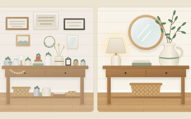
- Tables: wood on wood? Add ceramic and glass, gathered on a tray.
- Shelves: rows of similar objects? Mix in a basket, a wooden bowl and a few books.
- Windows: blinds only? Soften them with linen or cotton curtains.
- Walls: all flat frames? Include one piece with relief, such as a flat woven basket or a textile.
Fix the largest surface first. A rug or a pair of curtains changes more than a dozen small accents.
Why texture needs a quiet palette
Texture shows best when color stays calm. In a room of strong colors and bold patterns, the eye reads the color first and the weave is lost. Keep to warm white, a few neutrals and one soft accent, and every surface becomes visible. The guide to the farmhouse color palette explains how to choose them.
It works the other way too. The more restrained your colors, the more textures the room needs, so an all-neutral room is exactly where wood, weave, knit and stoneware earn their place.
Frequently asked questions
Why does my neutral room look flat?
Usually because too many surfaces are smooth and similar. When color is quiet, interest has to come from contrast between materials. Adding a woven rug, a knitted throw, linen cushions, a wooden piece and a ceramic or glass object gives the eye different surfaces to notice without changing the palette.
How many wood tones can I mix in one room?
Two or three is a comfortable rule of thumb. Choose one to lead, usually the floor or the largest piece of furniture, keep the others in the same warm or cool undertone, and repeat each tone at least twice so it looks deliberate instead of left over.
Do I need real natural materials, or do look-alikes work?
Either can work visually. What matters for the look is the surface: a matte finish, visible weave or grain and a muted, natural color. Choose what suits how you use the room and how much care you want to give it, and follow the care instructions that come with each piece.