Farmhouse Color Palette: Warm Whites, Soft Neutrals and Quiet Accents
How to build a calm farmhouse palette in three parts: a warm white base, two or three supporting neutrals and one quiet accent with a little black, plus how to sample colors in your own light.

A farmhouse color palette is quieter than most people expect. It is mostly warm white, supported by a few soft neutrals, with a single muted accent and a thin line of black to keep everything from drifting. Get those proportions right and almost any simple furniture will look at home.
The difficulty is that “white” and “neutral” each cover hundreds of shades, and the wrong pair can look dingy or stark side by side. Building the palette in three parts, in order, removes most of the guesswork.
Part one: a warm white base
Warm whites carry a trace of yellow, cream or beige. Cool whites lean toward blue or gray. The farmhouse look relies on wood, linen and woven fiber, all of which are warm in tone, so a warm white sits behind them easily, while a cool white can make the same pieces look yellowed by comparison.
Your base does not have to be paint. If the walls are staying as they are, the base can be the largest fabric surfaces instead: curtains, a slipcover-style sofa, bedding or a big rug. What matters is that the biggest area of color in the room is light and warm.
How undertones shift in daylight
The same white changes through the day. A north-facing room tends to have cooler, bluer light that can flatten a white toward gray, so a creamier shade often reads as plain white there. South-facing rooms get warmer light that can push a creamy white toward yellow, so a more restrained warm white may suit them better. Lamps in the evening shift everything warmer again, which is why a shade that looked right in a store can disappoint at home.
Part two: two or three supporting neutrals
Supporting neutrals are the mid-tones that stop a white room from feeling blank. Choose two or three from this family:
- Cream, a step deeper than your white, for cushions, throws and ceramics.
- Oat, the color of undyed linen, for upholstery and curtains.
- Greige, a blend of gray and beige, for rugs and larger furniture.
- Warm gray, for stoneware, galvanized-look metal and the occasional painted piece.
Keep them close in warmth. Hold each one against your white: if either suddenly looks pink, green or dirty, the undertones disagree and one of them should go.
Wood tone counts as a color
A wooden floor, table or set of shelves can take up as much visual space as a sofa, so treat wood as one of your neutrals. Honey and light oak tones are easy partners for warm white. Very red or very orange woods are stronger and work best when the rest of the palette stays pale and simple. Mixing wood tones on purpose is covered in the guide to farmhouse textures and natural materials.
Part three: one quiet accent and a little black
Pick one accent drawn from nature and slightly grayed, never bright:
- Sage green is the easiest, because it echoes the greenery already in the room.
- Dusty blue feels fresh and suits bedrooms and rooms with warm wood.
- Clay, a soft terracotta, adds warmth to a room that gets cool light.
- Mustard is the strongest of the four, so use it in the smallest amounts.
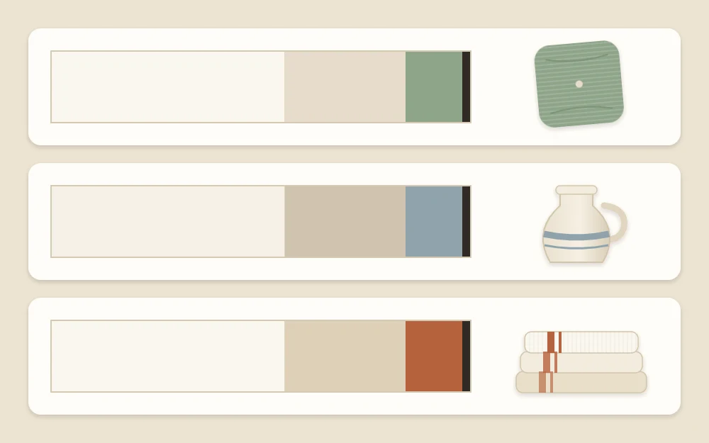
Then add black in small doses: a lamp base, a picture frame, a curtain rod, the handle of a basket. Black gives the eye a few crisp points and makes the pale colors look cleaner. The more black you use, the more the room leans toward modern farmhouse style, so add it gradually.
A loose 60-30-10 proportion
A common starting point is the 60-30-10 idea: roughly 60 parts of the room in the base white, 30 in the supporting neutrals and wood, and 10 in the accent, with black as a thin outline on top. Treat it as a loose guide, not a formula. Nobody measures a room this way; it is simply a reminder that the accent should be the smallest share.
In practice, that might mean white walls and curtains, an oat sofa with a wooden table and a jute rug, and sage appearing only on two cushions, a throw and a plant pot.
Carrying the palette from room to room
You do not need a new scheme for every room. Keep the same white and the same neutrals throughout, and let each room change only the accent or the amount of it. The living room might use sage, the bedroom a dusty blue, the kitchen a touch of clay in a tea towel and a crock.
Rooms you can see from one another benefit most from this. Stand in a doorway: if a color in the next room appears nowhere in the one you are in, repeat it once with a cushion or a jug to tie the two together.
Sample in the actual room before deciding
Colors cannot be judged on a screen or under store lighting. Before you commit to a paint or a large piece of fabric, test it where it will live.
- Brush a large paint sample onto card, following the product label, or pin up a generous fabric swatch instead of judging from a tiny chip.
- Move it around the room: beside the window, in the darkest corner, next to the floor and beside the sofa.
- Look at it in the morning, at midday and under lamps in the evening.
- Put your wood, your neutral fabric and your accent together in one spot and check that none of them turns odd beside the others.
Tip
If two whites are close and you cannot choose between them, the slightly warmer one is usually more forgiving beside wood and linen.
If you are still gathering the basics of the look, the beginner’s guide to farmhouse decor explains where the palette fits in the overall order.
Frequently asked questions
Which white works best for a farmhouse look?
A warm white, meaning one with a slight cream or beige undertone, usually sits most comfortably beside wood, linen and woven fiber. The exact shade depends on your light, so compare a few large samples in the room at different times of day before choosing one.
Can I use gray in a farmhouse room?
Yes, as long as it is a warm gray or a greige with a hint of beige. Cool, blue-leaning grays can look flat next to warm whites and honey-toned wood. Hold the gray against your white and your wood; if all three look comfortable together, it belongs.
How many accent colors should a farmhouse palette have?
One per room is a good rule of thumb. A single muted accent such as sage, dusty blue, clay or mustard, repeated on three or four small items, looks calm and deliberate. You can change the accent from room to room while keeping the same white and neutrals throughout the home.